Tuesday, August 10, 2010

What is true beauty?

Being a woman, there have been times I have definitely fallen victim to the images that the media portrays of women. From being the skinniest or to having flawless skin, women start to think that what the media portrays on advertisements is the norm and than start to believe that's what "true beauty" really is. The message that these ads are sending is that if someone wasn't the skinniest, or didn't have flawless skin, or even have the biggest boobs, than you are considered ugly. This message is not only targeted to adult women, but to pre teens and teenagers as well. More than ever, children and teenagers fall victim to eating disorders, loss of self esteem, and the dissatisfaction of how your body truly is. The American research group Anorexia Nervosa & Related Eating Disorders, Inc. says that "one out of every four college-aged women uses unhealthy methods of weight control—including fasting, skipping meals, excessive exercise, laxative abuse, and self-induced vomiting."

Here is an ad for man's body wash. Ad's like these are shown on an every day basis:
This woman is as skinny as can be, has huge boobs, and basically is saying have sex with me. When a child or teen sees this, they think that this is normal and that this is what there body should look like. More than ever eating disorders are extremely common in children and teens. Also, when a guy sees this, they start to think all women should look like this. The media makes women an object rather than a person. Even in the above ad you never see the woman's face... just her skinny, sexy body.

Whatever the stereotype, television, film and popular magazines are full of images of women and girls who are typically white, desperately thin, and made up by makeup artists to look perfect. What people fail to realize is that there is no such thing as "perfect". As a matter of fact, imperfections is what makes us beautiful. The scare you got when you were 9 tells a story of your past. Or your choice of style is beautiful because that's who you are.

Here is an actress Jamie Lee Curtis who wanted to show the public her true self, and than show what she looks like after she was all done up:
If more actresses and models showed what they really looked like, they themselves wouldn't look perfect. Because of airbrushing of the photos, or even just digital design, there are so many ways to make an average person look flawless. I believe the media should start advertising real women in their campaigns because real women are beautiful, and they are what beauty truly means. Also, the media has undermined the actual product. Why can't the media just advertise that the product is good? Does there really have to be some sort of sex appeal to every ad?


Perhaps most disturbing is the fact that media images of female beauty are unattainable for all but a very small number of women. Researchers generating a computer model of a woman with Barbie-doll proportions, for example, found that her back would be too weak to support the weight of her upper body, and her body would be too narrow to contain more than half a liver and a few centimeters of bowel. A real woman built that way would suffer from chronic diarrhea and eventually die from malnutrition.

The blast of messages about thinness, dieting and beauty, tells "ordinary" women that they are always in need of adjustment and that the female body is an object to be perfected. The overwhelming presence of media images of painfully thin women means that real women’s bodies have become invisible in the mass media. The real tragedy is that many women internalize these stereotypes, and judge themselves by the beauty industry's standards. Women learn to compare themselves to other women, and to compete with them for male attention. This focus on beauty and desirability "effectively destroys any awareness and action that might help to change that climate."

Here is an ad that is simply about the product, and that's it. Why is there a need for sex? Here is Santa Clause drinking a Coke. This is what ads should start doing, using fun ads for their campaigns.

...And we worried how movies would affect us


It is obvious that today’s advertising often portrays unrealistic and sometimes offensive messages to persuade consumers to switch to their brands. Jean Kilbourne’s “Killing Us Softly 3” highlights the use of symbolism, gender roles, and hierarchy and the effects that they have on men and women of almost all ages. First, gender roles are heavily emphasized in American ads by portraying the girl as passive, less powerful, innocent YET sexy while boys are portrayed as tough and, in some cases, outright abusive. One ad in particular that struck me as overtly sexist is the skateboard ad that Kilbourne points out. This ad features a male stick figure pointing a gun at a female stick figure and the caption “BITCH” is in huge letters on the seemingly simplistic ad. Is this necessary to sell a skateboard? Do you have to shoot your girlfriend/wife/mom/sister in the head to be good at ollies? Other ads have men asserting their power over women by standing over them, grabbing women by the hair, showing women in “innocent” and vulnerable positions. Only when there is race in the ad does the power hierarchy switch; the young black boy is kneeling down to the young white girl. The symbolic and even overt body languages and text in the ads have a profound effect on society and how we view each other.

The ad that I would like to focus on is an AXE commercial that happens to have an MTV logo on it (2-for-1!). Before seeing Kilbourne’s film, I already thought the commercial was ridiculous and downright sexist. AFTER the film, I noticed that they only make use of the unrealistic body type as well as zooming in only on the white women (I think I only seen 2 black women and it was probably CGI to be the same person) and the women are destroying each other by hitting, knocking down, and jumping over one another to get the rights to have this man. If he buys AXE, then he will be the ultimate male by dominating an array of women. This fits into MTV’s concept of “the mook,” or what a teenage boy is or at least should be all about. By appealing to the mook and stereotypes of the ideal male, perhaps AXE did make a number of sales. I know for a fact that sales of Old Spice went up 107% between May 19-June 19, 2010 due to the “Old Spice guy” ads (Time 10).
I chose to dissect this particular ad because it is one of the many that shows women in an array of wilderness settings (again portrayed as animals) in bikinis so we can get a great tit shot (because all they’re good at doing is being sexy) and racing to reach one man who sprayed his bodyspray (because no woman could ever dare to be without a man). This commercial almost sums up everything Kilbourne explains in her film. The only thing missing is the violence of men toward women, but the women are violent toward each other, so isn’t that just as detrimental? Can we fathom what we are doing to little boys and girls with these messages? Girls will never be perfect because they are too short, have little breasts, and should be vulnerable and passive as well as sexy and innocent. Boys should be tough, shunning the “feminine side” and embracing power and other things that are defined for men only.
The tough part now is creating an alternative commercial for AXE. This ad ties into the concept of the “mook” so much that it’s hard to even attempt to find an alternative mindframe for teenage boys. First, reinventing the concept of the product to not be a vagina-magnet is a good start. Next, coming up with a tagline that is both appealing and less stereotypical (again, how can you appeal to an audience that has become so accustomed to these stereotypes that they probably are unaware of other viewpoints). Maybe the creative director could emphasize that the shower gel will get the consumer clean mentally and physically, much like Orbit gum (clean up a dirty mouth) and “Messing with Sasquatch” commercial (even though these guys are kind of like the mook, the commercial is less objectifying). These commercials have some stereotypical qualities but are not nearly as offensive as this axe commercial. “Use AXE to cut through dirty thoughts and dirty armpits” is way better than “the more you spray, the more you get.” Yes, this does persuade the naïve mook to use MORE, but is it worth hurting the image of 50% of the population in doing so? My ad would be different because it slowly tries to break down these stereotypical barriers without turning the target off completely. Some things cannot be changed too quickly.


After taking a step back and looking at the advertisements I see daily in a critical way, all I can come up with is, “are people really that gullible?” and “why does feeding on these preconceived notions about gender and power influence a shopping choice so greatly?” Obviously some of this is working because the companies keep doing it. Numbers and money are the motivation for the continuation of this harmful strategy. Is it possible to help the public change by creating alternatives to these detrimental views or will it just turn off the target market and be a failure? It’s like the chicken and the egg reference; which came first, the stereotypes or the media that convinced us it was right? Either way, they go hand in hand and one must change to influence the other.


Barovick, Harriet. "The World; Ten Essential Stories."TIME. 176.6 (2010): 10. Print.

Woman and Advertising

Advertising has become much more than selling products. They are selling beliefs and life styles to American citizens. They portray woman as objects, objects that are their for the used of the dominant males in advertising. The "sex sells" method has gone too far when using the bodies of women in a sexual way is used to sell everything including fishing lines.

The advertisement here is for men's underwear, yet it shows a woman, barely dressed admiring his underwear. Even in an advertisement for men's clothing, a woman's body is shown off. Not only that but it is very clear that she just had sex with him and her underwear is shown to be somewhere else in the room. This kind of images show women as the submissive gender in our culture.

Even this add which is trying to promote a vegetarian cause shows the woman as "human meat". Not only that but she is almost completely naked with blood on her. Even though this add isn't for a product, but instead a cause, it still shows a woman as objectified. The blood on her doesn't help. It shows a woman as a piece of meat not a a person who faced violence. Advertisements like this make violence seem more ok.


There are advertisements in which males show off their bodies. However, these advertisements are not nearly as common and provide a different message. This advertisement for a gym, shows the man as powerful, rather than the ads that make woman seem submissive. Even though it is showing an ideal figure for men as many ads show ideal figures for women, this ideal figure is not a submissive sex object, he is powerful and independent.

Many advertisements show men and women together in which the man is dominant and the woman is submissive. Others show woman of color more as animals and even less than the white woman that are already being objectified. This adds an element of racism, showing that women of color are worth even less.


Advertisements, are trying to show women that they should be used and are lesser than males, while showing males that women are objects for them to use sexually. This is creating a culture in which men are violent against woman and women have a poorer and poorer self image. Advertisements have a much more powerful effect than most people think. Something must be done to make more people aware of these effects and stop advertisers from taking advantage of our culture.

Victoria's Secret is to look pretty and be quiet.....

I chose an ad from Victoria's Secret. This ad features many problematic images which Jane Kilburne discusses in her lecture. The commercial promises to sell "one thousand fantasies" with one gift. Then the commercial goes through various scenes which feature models with the body type that most women do not have, ie tall, thin, with broad shoulders, small hips and big breasts. All of the models in this ad are white women. The first message is that a fantasy woman would look like this. This poses the problem of creating an ideal standard of beauty which excludes most women, and certainly women of color. The unspoken message is that these women are beautiful, fantasy women, and anyone else is not.

Next, the commercial skips to scenes of the women. One scene features two women in the bedroom. This is framed not in an empowering way to women, but as a man's fantasy. The message is that a woman's sexuality is for man's pleasure only. Another scene features a woman against a wall while knives are being thrown at her. This scene is a fraction of a second long, but as the commercial repeats the words "one thousand fantasies" the violent image is associated with this word. This is an example of the romanticization of violence against women who are merely "things" and not people. This image is problematic because it perpetuates the notion that violence against women is not only ok, but a way to dominate women, which this commercial implies is one of man's "one thousand" fantasies.

Finally, the women each have the coy, pouty faces that portray them in a childlike way. The final image contains a woman covering her mouth, which is a presented as one of the "thousand fantasies" being the silence of women.


Advertisement: Are We Thinking Too Much?

Ever since the invention of penny press, mass media has been identified as advertising tools. Producers find the media tools that we possess as devices to influence consumers to buy products. It all came from the power of advertisement. A powerful and attractive advertisement attracts people. Then, if people are attracted to the advertisement, they are most likely to buy the product that the advertisement sells.

How does one advertisement attract people so much that they are provoked to buy a product? The answer lies within the advertisement itself as an artwork that is created by an artist. Companies pay professional artists to provide them with attractive looking photographs (or videos) that can sell the companies' products. They make sure that these artists produce enticing pieces of artwork no matter what their artworks portray. So, most artists find themselves working with the ideal women. These women possess the appearance that men desire and women want: goddess-like beauty, bone skinny, and above men tall. Thus, most advertisements that portrays these women are often the ones that attract consumers the most. However, Jean Killbourne, a feminist author, argued that most advertisements are attacks on women and how they perceive themselves. Advertisements like these create a sickening trend in women. Since these models attract men's attention, women unconsciously (or consciously) think that this is what men want from women. In other words, women see that they are and they should be the women portrayed in advertisements. Unfortunately, this "normalcy" is a growing trend that hurts women worldwide because they should spend their life on perfecting themselves.

skinny-models
photo courtesy of momgrind.com and bnet.com

An article by Maja Tarateta states that advertising and art has been walking hand in hand ever since mass media was born. The two cannot be distinguished from one another. Artworks in general communicate with people. They grab people's attention and immediately connects with their souls. Producers need this quality to sell their products. At the same time, artists need the job to feed their needs. Then, these artists are providing advertisements that can grab the attention of people by displaying attractive women.

photo courtesy of bild.de and pzrservices.typepad.com

In Killing Us Softly, Jean Killbourne primarily discusses about women being sexually "abused" in media, especially in advertising. Pictures like the ones above are more or less how women are treated in advertisements. They are shown to be sexual deviants, inferior to men, and gold diggers. To women and a lot of girls this shows that sex sells, do not go against men, and do your best to make yourself pretty. This trend of thought gives birth to little girls who only think about their superficial beauty. Douglas Rushkoff, in his documentary video called "Merchants of Cool," coined a term for these little girls, "the midriff." Certainly, this generation girls is hurting America. Not only that it defects the mentality of women, but it also degrades the morality of both men and women.

Below are alternative advertisements that do not possess the usual kind of advertisement. They are the "better kind" of advertisement. The three pictures show normal and plus size women. Bones are not visible and their breasts and hips are proportional. Although these three pictures are edited to make their skin flawless, they are nonetheless "more acceptable" for feminist minds. Do they solve offensive advertisements posed before? Not quite. Most normal and plus size advertisements portray women in their underwear. Thus, alternative advertisements like these do not necessarily lessen the sexual message.


In sum, advertisements are art forms that can be viewed as artistic yet  offensive to people. Advertisements, or commercial arts, are like videocassette recorder. They provide the option for the people to consume things they want to consume. Depictions within these advertisements might be offensive, but this is not the fault of the producers or artists. Producers are selling their products and artists are simply displaying their abilities. We, as consumers, seek for astonishing things on advertisements because they grab our attention. When we're drawn into an advertisement we have the urge to buy the product. In addition, strong advertisements spark juicy conversations. Like popular news, people like to talk about sexy and naughty ads. Indeed, there are better ways on how to advertise, but in actuality, ads that do not attract do not sell. With a lot of movements going on today, we are moving towards something. Hopefully, we will reach a time when advertising can be pleasing to the producers, consumers, and people in general.

Advertisers and Women

      The advertising world has been playing the same horrible racial and sexist joke for decades.  Advertisement is to communicate an idea related to the product.  The advertisement needs to communicate an idea to a particular public.  Therefore, this creates a division that classifies members of society by a type of users.  The distinction is by gender and race. There are special products, clothing and make-up for a white woman and there are special ones for a black woman.  This distinction places barriers in the communication between a white woman and a black woman as users.  In other words, the products become an obstacle that extends in the middle of their communication.  In order to solve any racial differences among people, especially women, who have already been discriminated by their gender, those types of advertisement should not exist.

    In “Killing us Softly” by Jean Kilbourne, she raises a question about how far advertising goes to sell  a product.  In order to make money, they destroy women’s self-esteem and offer a product that reconstruct them.  Kilbourne finds out that what links advertisements together is not the tactics of selling, such as the way to reach people or the media that is being presented, but what links them together is the animalization of women, sexism, racism and humiliation.

     Cesar, a company that creates food for pets, has an advertisement that shows two side-by-side pictures of a pretty girl next to a nice Spanish cocker.  The two images are blended together at equal in sizes, color tone and composition.  From the artistic perspective, the image is well-balanced.  From the use of this image system, this creates a quality of a woman and a dog, and they are not distinct from each other.  They both are irrational and dependent of instant gratification.  “Delight your little dog” at the bottom of the image under the dog’s side distracts our attention to see critically into the woman’s perspective.  This phrase can be seen from two points of views.  The first one is direct; the “dog” is the woman and the “food” is the sexual reward.  The second one is indirect; to a male audience, the advertisement is telling them to give themselves the pleasure of delighting themselves with a woman, who is below in certain levels.

   In a youtube video called “The Photoshop Effect,” it brings the awareness of how photographs in a magazine have been retouched in an extreme way to create the perfect figure.  The explanation from people in the advertising market in the video express their concern about how any cover magazine can create an astonished reaction in young females when they see a picture of a perfect body.  Their opinion should be a sign that alert readers about the excessive use of photoshop.  As the smoking industry demands a cigarette brand to print a health warning on the box, magazines should have the same regulation to protect the mental health of young women.  The bottom of the photograph should a contain a message saying that the image was distorted and photoshopped to attain a desired effect.

    However, we should not only blame advertisers for dehumanizing women.  Advertisers draw their ideas from a society’s culture.  If society marginalizes women, advertisers will do the same.  According to Sut Jhally, “Advertising...does not work by creating values and attitudes of nothing but by drawing upon and rechanneling concerns that the target audience (and the culture) already shares” (79-80).  He also argues, “Advertising is not simple manipulation, but what ad-maker Tony Schwartz calls ‘participation,’ with the audience participating in its own manipulation” (80).


       The Colombian artist Fernando Botero used rounded images of women in his works and saw beauty in this form.  If society follows his idea of female beauty, advertisers will also trail along, creating advertisements where the rounded woman, not the size zero woman, is beautiful.  Therefore, in order for us to rid the distorted advertisements of women today, we need to readjust our values and standards as a society.

Works Cited
Jhally, Sut. “Image-Based Culture: Advertising and Popular Culture.”  Gender, Race and Class in Media: A Text Reader 1 (1995); 77-87.

Photos Credits
http://www.soho.com.co  Revista Solo Hombres (SOHO)

http://www.boterosa.org Colombian Art Foundation
ildeltadellaluna.net         Botero's bailarina
iftyisthenew.com   
Images powered by Google.com 

Video Credits
The photoshop effects www. healthdiet.com ; http://www.youtube.com/watch?v=YP31r70_QNM   
Videos powered by Youtube.com

Mornidine Sickness

Since the inception of advertising, women have been marginalized, objectified and have had their portrayals relegated to subservient stereotypes in order to sell various products. Particularly before the second wave of the feminist movement (in the mid 1950s), these misrepresentations of women--constructed realities contrived by male executives--hampered any potential social progress.

Inspired by Killing Us Softly 3, I decided to focus on the image of the housewife as a submissive domestic. I chose two advertisements, the first being the stereotypical wife as a housekeeper, the second representing a slightly more evolved alternative. Finally, I will offer my suggestion for an ideal representation of the theme.


This image depicts a typical early 1950s housewife, smiling as she prepares her beloved husband breakfast at the stove. The text "Now She Can Cook Breakfast Again" seems par for the course (albeit inexcusably sexist) in an advertisement from this time period--until the actual product is revealed. Mornidine was a medication to combat morning sickness. This ad conveys the notion that an exhausted mother-to-be
(dehumanized with the use of "she" in the tagline) in the first trimester of her pregnancy will be cheerfully cooking eggs and bacon for her husband if she pumps her body, and in turn, the body of her unborn child) full of pipamazine (a drug now known to have caused devastating birth defects on children whose mothers took the drug in early pregnancy). (Source)


This 1960s advertisement depicts a smiling man, carrying a large tray of breakfast food in a robe with the accompanying text, "See The Conquering Hero Comes...armed with Sunday breakfast for his deserving bride." This seems to be an improvement over the previous advertisement, with the male bringing breakfast to his "deserving" wife, implying a bit more respect for the female subject. There seems to be equity between the couple, as breakfast for two is laid out on the tray, although the title of "hero" insinuates that this robe-donning man's wife needs to be rescued, and as a result, an imbalance of power is suggested, especially since the woman in his life doesn't seem to have any other function than being a "bride".

SOLUTION:


Clio-award winner, this isn't. However, this modified print ad serves to demonstrate an enlightened marketing strategy for the Viyella robe. This man is celebrating his wife's occupational achievements, and doesn't have the title of "hero" bestowed upon him simply for boiling eggs, slicing a grapefruit and setting them on a tray. An equal balance of power and respect is demonstrated, and the product is prominently (and effectively) featured in the advertisement.

Sexy Alcohol


Ok, so we all know by now that sex sells. Ultimately what companies want to do is sell their products at any cost, using whatever means they have available to them. Now a days we can find sex in adds, and sexist adds almost everywhere we go, such as this one on the left. I chose this image because I had to look at it for months wile riding the 6 train to class, as I am sure you all have. It did confuse me at times, as I didn't know what to make of it. An add for alcohol, portraying sex, on a subway cart? While kids of all ages ride the same subway and have the same add flaunting in their faces, I thought it more than just inappropriate.
This is an add for a cognac, meanwhile the images showing have nothing to do with how good the product is. Or maybe every time two girls drink it they chain each other and want to bite one another. Although in the occasions that I have drank Remy Martin, that has never happen to me or any of my girlfriends.
This add doesn't only provide us with a sexy scene between two women. It also give us the degradation of comparing women to animals. One women is chained, and submissive, while the other one is aggressive and ready to bite her. Are we dogs?
Also let me not forget to mention the slogan that reads: "Things are getting interesting". This is obviously an add aimed to men, and its telling them: if you give girls enough Remy Martin, they will hook up with each other, only for your enjoyment. Isn't that nice? What elementary school children wouldn't want to see this add on his/her way to school? We are creating a society of sex and sexism with adds like this. We can say we know better and we don't believe or follow things like this. However children are being brought up looking at images like this, internalizing them, and sadly thinking this must be the norm. We must put a stop to sexism now, because once this children grow up they are going to create more adds like this one, and it will be a non-ending cycle.
Why don't we make commercials that show what really happens, such as one that says: if you give girls enough Remy Martin, she will throw up all over you!


Image courtesy of: utopiography.com

"BECAUSE YOU'RE WORTH IT".


According to Kilbourne young females in our Westernized society should either rebel or follow the rules. Is there any other way? What if I don't want to diet or rebel with black nail polish? What should i do? I can not call myself a feminist but I am far from depressed. Right now we, females, are living in a very strange society - everybody understands that the media is providing bad examples of the "IDEAL" shape, lifestyle, look, relations etc., but the media magnates do not want to do anything to change it. Where is the human factor? Is it all about money?

In the video" Killing Us Softly" we can see everything that feminists, anti racists, gays and other movements are fighting against. Who created those advertisements? Homophobes and racists? In every commercial women are looked upon as objects of desire without much intelligence and of course half naked. After this video i was in shock, because we are watching commercials every day but do not really pay attention to detail. One of my favorite and most disturbing commercials is a L'OREAL slogan "BECAUSE YOU'RE WORTH IT". Who can decide what i am worth ?
As on the pictures on the top - females and males are represented in different social roles and it is does not matter how old the model is. Females are presented in a seductive, but passive position while males are depicted as leaders, hunters and very masculine. Same with kid advertisements - girls are very feminine and in group pictures boys are obviously dominant.
Question is - why is it this way? Answer is that we are living in the world of homophobes. What is proper for females is to be feminine, quiet and not share thier opinion. Women should be seductive, skinny, sexy, provocative BUT not dominant. All what " we are worth" is to be beautiful.

Advertising


http://www.shoppingblog.com/pics/lady_gaga_alejandro_still.jpg

http://www.fun.net.pl/Zabytki_From_Hell/2004/2004-05-26/Group_sex.jpg


This is a photo image of Lady Gaga during her performance in the video of alejandro. I chose this ad because I am also obsessed with Lady Gaga’s modern art performance. It is a group of men suppressing Lady Gaga like a sandwich in the middle. It is telling a story that a woman is about to get raped by a group of males in jail. One interesting thing from this photo image is that Lady Gaga is the only one who is not passive among a group of males. I think this has something to do with who is the main character in the performance and it also has something to do with the setting of this story.

Sexism is expressed in this photo image. As we can see, Lady Gaga is in the middle as an inferior character. Then all males in this photo image are masculine type. They have muscles and they are controlling. Their hands are around Lady Gaga and all of them are demanding sex from this only female.

Racism is not too obvious in this photo image. There are only white people, very homogeneous. However, let ‘s think about why there is no other race in this photo image. I wouldn’t get rid of the possibility that white people only care about white people. Why bother to tolerate other racial groups of people if they are not even dominant power?

Power hierarchies are also presented in this photo image. Males are masculine and represent a central dominant power. The only female there becomes weak and represents a victim of sexism. Males have every reason to get what they want until they get it. Female there can only use sex as a way to trade what they need. It ends up with this female is singing her misery to relieve her pain.

In Killing Us Softly, we are told that traditional advertising never ceases to stir our emotions by representing sexism. During sex, guys are always active and women are always passive. In the photo image I chose, males around Lady Gaga are so demanding of sex with her. On the other hand, Lady Gaga seems helpless and can only make this compromise in the middle of a group of masculine men. I think the goal of this ad is to attract audience and invite them to watch what is really inside this video. An alternative path I can suggest is to get rid of sex. Lady Gaga is beautiful and smart. Her performance is thrilling and spectacular enough. For her ad, I’d rather just show her helpless emotions by positioning her in a broad stage.

An alternative photo image I have found for this sexual ad is an animal ad which shows that the most inferior cat at the bottom is angry to death because of this power hierarchy. It is kind of thrilling and cute because they are cats rather than human beings. This photo image is also very impressive same as that of Lady Gaga except it doesn’t really give people too much imagination about sex. It is not that I am against traditional advertising or sexual activities, it is just that I think showing an impressive photo image as an ad is attractive enough because being sexy is not the only way to attract people.

Sexism In Advertisment

Though they say women and men are now equals, it is obvious that sexism is still a big part of our culture from looking at our ads. These ads represent “a kind of statement on what it means to be a woman in this culture” (Kilbourne). In these ads, women are chosen to represent objects or animals rather than being human beings.


Below is an ad that shows a woman whose only purpose is to please and be a beer stand. The advertisers compares the beer to a woman, an object that can be shared with friends. I chose this ad because it basically says how useless a women is as a human being. This is common in ads where women are depicted to be an object whose only purpose is to please men.


What ads should focus on is the quality of their product rather than using sex to sell the product. As an alternative to the previous ad, the one shown below focuses on why their beer is good. The ad does not show a naked women but rather ordinary people enjoying the beer they are advertising.


“Advertising sells […] values” (Kilbourne), and the values that are being promoted in today’s culture are sexist, putting power into the hands of men. Advertising “tells us who we are and who we should be” (Kilbourne) and these ads tell women to be items. There are serious consequences when women are promoted to be mere objects. Women feel devalued, that they rather exist to serve men than live alongside them.


Kilbourne states that objectifying women is the “first step in justifying violence”. Domestic violence has been an issue that still exists in an age where both genders are entitled to the same rights. These advertisers are not just promoting their products, they are also promoting sexism and violence. Advertisers should focus on the selling points of their product instead of using sex to sell.


Monday, August 9, 2010

A New Generation of Lost Innocence

The use of sexuality has become overtly pervasive in our society. Even ads that are targeted for the younger generation are starting to be plagued with sexual connotations.

I found this Lego ad particularly disturbing. Especially since Lego is a Danish company that sells children’s toys that consists mainly of plastic building blocks and bricks. In this ad, the first thing you notice is the emphasis on this woman’s chest. Her cleavage is censured and perhaps too graphic to show. The seductive look on her face with her gaze directed at the male suggests that she wants to lure the man onto the bed. Her hand is placed on the bed implicating that she’s not going anywhere. This male’s hand is placed strategically near his hip, insinuating that he’s about to drop trou but hesitates as he looks at the woman on the bed with admiration.


Now this is a Lego ad. Why is Lego, a children’s toy company promoting this kind of ad in the first place? Kids shouldn’t watch too much TV, that’s why. This ad has nothing to do with the promotion of Legos. Just a clear and provocative message to children and adults, whatever you watch on TV, just don’t watch too much of what’s going on this ad.


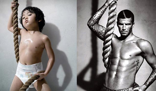
When we think of diapers, we associate them with infants and toddlers. I happened to stumble upon a diaper ad that just happens to sell diapers in a very unconventional way. What I found especially convoluted about this South Korean diaper ad promoting Good Nites pull-ups was a toddler with a glistening chest of body oil selling more than just diapers. The look in the male toddler’s eyes is quite provocative with him holding a rope around his torso. I think the main purpose of the ad was to show customers how great the diapers on the toddler looked and that this is how your toddler can look with them on too. Although this ad serves as a parody of the David Beckham Armani underwear ad on the right, it has potential child molesters and pedophiles thinking something else.
Although the media is known to promote their ads with young, svelte and sexy looking women, a new wave of curvier women has started to embrace the ads in many glossy magazines. A classic example of this is Dove’s Campaign for Real Beauty and Self-Esteem Fund, which features a wide diversity of realistic and fuller voluptuous looking women posing in their underwear who deviate from the mainstream Victoria’s Secret model body type.

In recent years magazines such as Seventeen and Glamour have begun to feature full-figured models in their spreads. The popular teenage magazine, Seventeen has even featured the “curvy” winner of America’s Top Model, Whitney Thompson on their cover. To help developing girls enhance their self-esteems, Seventeen has even launched a self-esteem campaign similar to that of Dove’s Self-Esteem Fund, called the Seventeen Body Peace Project to help young developing girls feel proud of their bodies, no matter what their shape or size.


In the future, more ads should feature more realistic looking woman, so that there will be more appreciation for fuller-looking women which will allow many people to gradually change their unrealistic views about women needing to looking stick skinny in order to be deemed attractive. Curvier women can just be as appealing as skinner women if not more so.


Picture Sources:

  1. Lego Ad
  2. Toddler in Diaper & David Beckham in Armani
  3. Dove Beauty Ad
  4. Victoria Secret Models in Body by Victoria Underwear
  5. Whitney Thompson, winner of America's Next Top Model
  6. Full-figured Women in Glamour


Women and the Advertising Age

Media advertizing is one of the greatest means of selling a product as it continuously influences the culture we live in today. In killing Us Softly, the message of speaker Jean Kibourne is very clear. She reviewed how and whether the image of women in advertising has changed over the last 20 years. Nowadays we live in a society where women are considered and viewed as objects rather than subjects. Women’s bodies are regarded as things and in most ads parts of that thing is what is most focused on.

Another thing that advertizing brings is the idea of sexism and physical perfection. Nowadays we have computers that allow us access to high scale of technology, one gets a handful on creating the ideal perfect female that is flawless and has no lines or wrinkles anywhere. One can easily Photoshop and airbrush any picture and make perfection. But with every benefit comes a great deal of drawback. On the one hand, one has created and is showing the perfect and ideal beauty of a woman or who and how a woman should be while it degrades more than the majority of women who do not look like that ad. Not only it leads female to low self esteem but it creates a generation of female that will do anything to look like that computer made physical perfection and that can generate from plastic surgery to buying useless products. Another thing that it ultimately creates is the idea that if you are not looking as perfect as the woman on that ad, chances are you just not trying hard enough and that not only challenges them to want to take the extra step as they loose sensations by becoming an object of someone else’s pleasure but it raises questions on the minds of men about the real woman they are with. Another interesting aspect of the advertising Age that is mentioned several times in killing us softly is the fact that these sexist advertisements is that they create an arena for racism and labeling women of color as animals, which automatically dehumanizes them. In some cases they are literally shown dressed in animal prints and leopard skinned clothing.

To better explain this I chose to show this picture of supermodel Naomi Campbell that was taken by photographer Jean-Paul Goude in 2008.


http://fashionbombdaily.com/2009/08/13/caged-black-women-grace-jones-amber-rose/

Clearly in this picture, one can understand what Kibourne was explaining when it comes to making women other than humans but more specifically dehumanization of women of color who are far removed from white and therefore closer to the supposed animals their ancestors roamed with, and that is the Africans in Africa before slavery.

sources: http://fashionbombdaily.com/2009/08/13/caged-black-women-grace-jones-amber-rose/

womanizer


Jean Kilbourne discusses in “Killing Us Softly” womens' advertising and its effects on women and girls self esteem, and the way men perceive women as a direct effect of these advertisements.
source: cache.jezebel.com
Kilbourne describes how advertising creates the idea that a woman can only be happy if she is thin, tall, with large breast, flawless skin, and no wrinkles.
Advertising for women has been and still is focusing on external looks and strengthen the obsession of women with beauty, thinness and youth.

Kilbourne mentions one issue which draw my attention the most. The use of women’s body as objects. As Kilbourne’s emphasis women’s body is turned into a thing, and object, such as a beer bottle, or a perfume's bottle. The idea that a woman’s body, alive and breathing, is turned into a still inanimate 'thing' is appalling. It makes women seem easy to get, as easy as it is to get the bottle of beer or perfume. The implications of that are crucial “ We think of the person as less than human and violence becomes inevitable” (Kilbourne 2009).
source: www.womenxone.com

It seems to me that although our world is developing and progressing where women are now allowed to vote, work, get higher education, and get prestige jobs, advertisement, on the other hand, seems to take women back to the time when they were submissive and illustrate them as shallow sexual objects.

However, some changes are occurring. JP Morgan on of the biggest global
finance service firm advertises their 'winning women' as successful leading women who work for JP Morgan. In contradiction to the use of women’s body in the beer and perfume adverts where the woman is wearing a swimsuit, here the woman is wearing a business suit. Instead of portraying her as a bottle, in JP Morgan advert her image is covered by slogan to encourage and inspire other women to come and be successful as she is.
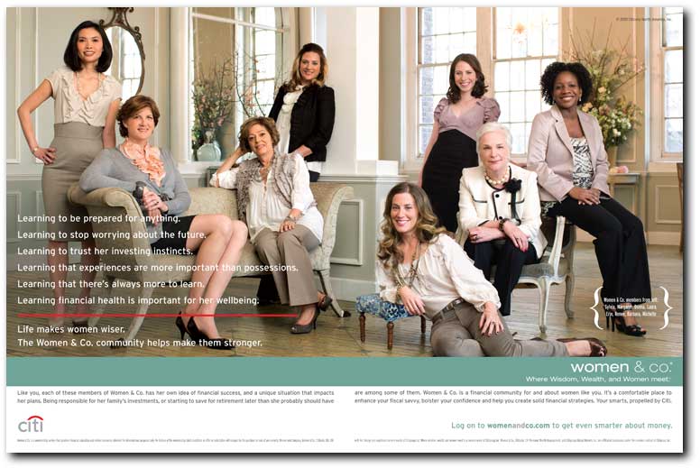
Citi and women&co advert also demonstrate the small but important change in women's image in advertising. In this add their are a group of women in a range of ages of early 20 to late 60, already a turning point from the 15-25 years old girls used in popular adverts. There is also a woman of color with white women, another example of progress from the white as normative poplar media. The women are all dressed in smart clothing, not half naked like in the beer advert. And the topic of the advert encourages women to become stronger independent women.
source: 2.bp.blogspot.com


source: thefinancialbrand.com

Woman and Sex


After watching Jean Kilbourne’s “Killing Us Softly 3”, I wonder why there are so many advertisers mentioned about sex, especially women. I totally agree on some of her point of view. Base on Jean Kilbournes’s idea, perfect woman must be tall, skinny, and with a good shape of body. This standard has created by the advertisement. We can see there are many posters and commercials mostly related to woman and sex. In fact, a perfect woman body is more attractive than others. Even thought the product is not necessary for life, but the advertiser just makes it important and alive by using woman and sex to interpret.

Today, I am going to focus on alcohol advertisers. I have been finding more and more sexy woman, or even naked women are related to alcohol advertisers. The liquor business has long used sex and women to sell its brands and products. Most of these advertisers are showing breasts or legs of women. I believe this is one kind of marketing strategy --- to catch viewers’ eyes. Some of the alcohol advertisers are very extreme and overload.
In the first advertiser, we can see there is an almost naked woman lying on the millions of Budweiser beer lids, and only cover her important and private area by few beer lids. She is holding Budweiser beer with her left hand. What does the advertiser first attract me is the sexy body of the woman. I am sure others will do the same thing too. Second, I realized this is a beer advertiser after I saw she is holding a glass of beer in her left hands. Now, the woman has become more important and central than the beer. It looks like the advertiser is selling the sexy lady instead of beer. Furthermore, I think this advertiser is overload, and it must affects
children who below 13 years old.

In the second image, there is a naked woman bended her knees on grass, and she was trying lie back. She wears nothing on her body, except a high heel. We can also see that she just got tan due to her bikini shadow. I do not like this advertiser at all. I cannot see the girl in the image brings us any idea of the alcohol! Besides, the position of the lady is not making any sense at all. It just looks so weird to me.
In Jean Kilbournes’s “Killing Us Softly 3”, she mentioned most ads has turn woman as a subject into an object. These ads are showing violence against women. In most advertisers, women objected themselves and they look like they enjoy and happy with their hot bodies. Why do most of alcohol ads contain women and sex? I believe there are better ways to sell the products instead of using women and sex in the ads.